How to Create a Winning Logo

30

A logo is a visual representation of an entity, may it be a business, a church, an organization or an individual (remember when Prince dropped his name and wanted to be know by his logo?). My company, The A Group, has created hundreds of logos over the past several years. The process has been as simple or as complicated as each client, but at the end all good logos ultimately share the same DNA.

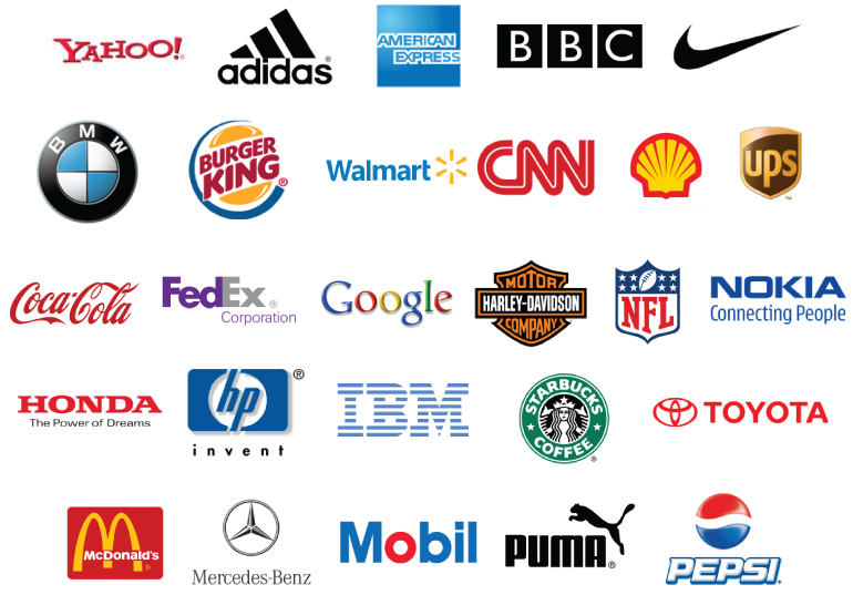
famous-logos

1. It can be reproduced in one solid color. If your logo needs two or four colors to look good or it needs that nifty 3D effect to look ok, it’s not a successful logo. If it works in solid black then it will work in any color or rendering.

2. It’s simple. I cannot tell you how many times I have run into logos that tried to “tell a story.” Like verbosity, these overly symbolic logos look dated soon. Churches and ministries are the worst offenders. I once had to say, “No, you cannot have a dove, a cross, a boat and flames in your logo.” I still have nightmares of the burning boat when I think of that design. The logo does not have to bring meaning to the design. Your organization can give meaning to your logo. Think of the Nike swoosh. All the meaning it conveys has been brought by what Nike stands for and not because of its mark.

3. It’s reducible. A good logo can be put on the side of a building as well as on the side of a pen. It should look just as good on your website as it does on your company polo shirts. The more lines and detail it has, the more difficult it is to reduce.

4. It Does not have to be a mark. Some of the most recognizable logos are font treatments and do not have a mark. FedEX is a great example of a powerful font-based logo. Again, sometime the simplest is the best.

5. Helvetica never goes out of style. Never. If you want timeless, than stay away from trendy fonts that look cool today and will make you look dated 8 hours from now. Sears, 3M, American Airlines, Toyota, Target  are all done in helvetica. The list goes on for miles.

What else would you add to the list?


  • Jan Roberts

    I like the idea that a logo should work in a simple one color. Too many of the new logos today are complicated ones. 

  • Ahhh – one of my favorite topics!!   Appropriate and authentic representation of the company.  Infusing visual elements that relay the tone and personality of the company help to build longevity and recognition.   I could go on…but won’t.   🙂

  • DaisyKNine

    Love your posts. So one question: I took a look at the A Group logo and noticed that the graphic looks like a lower case “a” and a lower case “q” merged together. ?? It also relys on a different color A to differentiate from the rest of the text.  Based on your suggestions, how would you  make changes to yours to make it more effective?

    • Our mark is comprised of two lower case “a” letters combined. One is flipped. The mark itself is solid and always one color. It has been reproduced on pen as well as embroidered without losing detail. The words “The A Group” work in a solid color and are Helvetica. I believe it fits all my criteria above.

  • When I design a logo, I try to stay away from effects like gradients and drop shadows and all that. It may look cool now, but those effects go in and out of style so much that it quickly makes the logo look dated, or hard to work with in different formats/styles.

    • Jason that is so true. Effects have a way to date a logo faster than you can say, “drop shadow.” Again, if it works in a solid color, it will work with any effects later.

  • vector is best. try to avoid raster as much as possible.

  • Such a great post. I’ve been thinking about maybe creating a logo for my blog and this is very helpful. Never underestimate the power of simple.

  • Pingback: Whats a Good Logo? « … tacticalpreacher …()

  • richard johnson

    Dang! That’s good! And I didn’t even have to pay for it.  Thanks a lot.  I’m in the process of designing a logo for our not-for-prof reading program deciding whether to just go with the name as the logo.  I’m leaning more heavily this way now.  Thanks again and again.

    • Richard if you feel guilty about getting all this for nothing, feel free to send me a Starbucks card. 🙂

  • Derek Brown

    This is so true.  I work for a market research company and we do logo testing (in addition to ad testing) and consistently, our results point to the exact guidelines you lay out.  Well done, thanks.

  • Great points! Do all of those apply to logos that will be strictly web based? For instance…I’m starting an online magazine and actually using a subtle animation as a key point for the logo. Is that a no no?
    http://www.sundaymag.tv

    I’ve had folks argue for both sides. 😛

    • gonnabepre

       Is the logo you speak of the one on you site now?

      • Yep. Only a little slower animation when the issue actually drops.

        • Bryan Randolph

           I like it.  I think it’s super simple and the blinking cursor creates anticipation for what’s next…  of course it would be impossible to create a hard copy, but for online, I think its great.  I guess you could use an ellipsis – “Sunday…”

          When is the site going to go live?

    • Jonathan, I always think about the many uses of a logo. Even though this is an online publication you might want to create a mug, an embroidered hat or shirt, that might show up on a magazine and if the blinking has to be there to make sense of what it is, I would not do it. 

      • Ya. I do plan on making some business cards…but I think the static bar works decently. 🙂

  • gonnabepre

    Great points, and super simple.  I am in student ministry and do lots of logo design for other ministries around town.  The number one request is a strange word that means something totally different than what is expected.  The movie “That Thing You Do” is a great example.  The had a great logo/band name, the Oneders.  The guy pronounced it “O needers.”  Suppose to be “wonders.”    

  • 100% agree! 

    I would add “memorable” – however, yes, this is subjective and more difficult…and achievement is measured with each viewer.   But we always ask, when someone sees the logo the 2nd time around, will they remember seeing it the first time?   Amazing how many don’t.  Not a concrete measure, but something worth discussing.

  • Anonymous

    OK, this bit of direction is timely and helpful. Just saying! 

  • dylan bush

    helpful

Share “How to Create a Winning Logo” by Maurilio Amorim

Subscribe

Delivered by FeedBurner